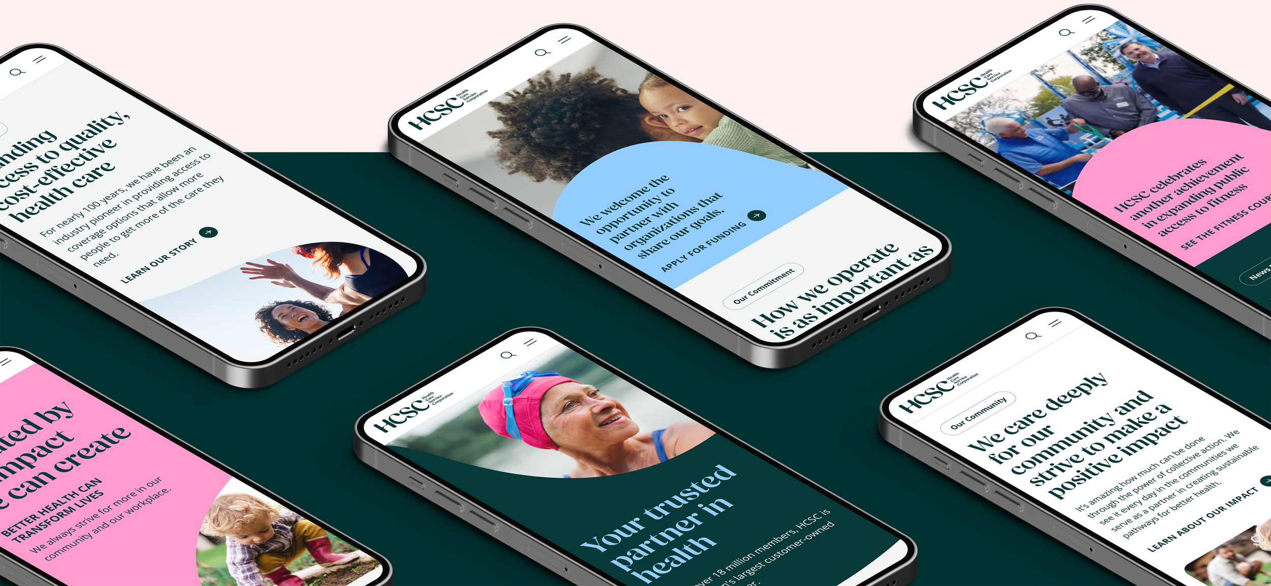
HCSC is a member-owned insurance company whose mission is to provide as many Americans as possible with the highest quality healthcare plans. They had just undergone a massive rebrand prior to coming to us for a website redesign, and it was by far one of the raddest glow-ups in the insurance industry. Their site — and their previous brand aesthetic — was stale and uninspiring, taking the typical blue and white palette and lackluster sans serifs straight from the healthcare industry playbook. They needed to differentiate themselves in the marketplace and expand their shiny new brand into the digital space.


Some key features of their new brand were their library of quirky, organic shapes, their friendly and approachable serif typeface, and their bold color palette. While the shapes were beautiful and fun to work with, particularly when making them interplay with photography, they presented serious challenges incorporated into a living, responsive digital experience. We also found that the serif typeface, while gorgeous as a larger headline, completely fell apart when used at smaller sizes or in larger blocks of copy. Finally, their colors were so vivid and expressive that many combinations, while beautiful in posters or single graphics, created sensory overload in the digital space.
During our extensive design exploration phase, when we were attempting to familiarize ourselves with this new brand like one would a new language, we had a realization: despite the bold and seemingly freeform nature of HCSC’s new brand, restraint would be our greatest ally.
“This team brought a fresh, bold design to life. The result is not only beautiful but also delivers a significantly improved experience for our users.”
— Client Stakeholder
Working closely with HCSC and their branding agency, we ended up establishing guardrails around blocks of copy that utilized the serif font: a maximum number of lines, and a minimum font size. All other copy blocks would utilize their brand’s secondary typeface, Open Sans. We also limited the number of allowable typeface weights, so there wouldn’t be visual clutter created by too many typographic styles. The blob-like shapes would also only be utilized in certain components, so as to keep their usage intentional and not overdone. Finally, color was carefully considered and evenly balanced throughout the components used on each page, and a few colors in the palette ended up not being used at all.
outcomes & roles
HCSC was thrilled with the design every step of the way. The energy on our last few review calls in particular was electric, with everyone from the branding agency and HCSC alike raving about how stunning it all looked. They couldn’t wait to see it all come to life, and the development team did an outstanding job making the finished product pixel perfect.
-
Led the interface design and directed a senior designer
Established the visual tone for the desktop and mobile web interfaces
Created a modular atomic design system
Provided UX assistance to another team of designers
Regularly presented to client stakeholders
-
Worked closely with developers to ensure our designs, animations, and microinteractions were possible to build within our timeline and budget
Pivoted as needed to ensure timelines were honored but design quality was not sacrificed
-
Provided the product team with annotations around UI, UX, accessibility, animations, and microinteractions so design intent was clearly understood and developers could properly point tickets
Participated in sprint demos and agile ceremonies to ensure design integrity was maintained throughout the build phase
-
Collaborated with a copywriting director to inject the signature HCSC brand voice throughout the experience
Ensured copy was succinct and fit comfortably within our designs
-
Worked with a lead content strategist to help tell HCSC’s story throughout the site and establish a taxonomy for the Newsroom page

